 A proportional circle map is a statistical map that shows its information by using circles that are proportional to the information that is being provided. In a range graded proportional circle map, only a set number of circles are used to convey the information that is provided. This picture tries to represent what the population in the region might look like in the “real world.”
Friday, August 8, 2008
Range graded proportional circle map
A proportional circle map is a statistical map that shows its information by using circles that are proportional to the information that is being provided. In a range graded proportional circle map, only a set number of circles are used to convey the information that is provided. This picture tries to represent what the population in the region might look like in the “real world.”
Continuously variable proportional circle map
 A proportional circle map is a statistical map that shows its information by using circles that are proportional to the information that is being provided. The circles come in this continuously variable proportional circle map shows circles of different sizes which represent the distribution of the variable.This particular picture is of England and is dealing with the major industries in the country and the circles are proportional to the variable being measured.
DOQQ

DOQQs or digital orthophoto quarter quads are digital images produced by the USGS. They contain orthorectified aerial photography at a resolution of 1 meter. The uniform scale of a DOQQ makes it possible to determine map measurements or to overlay information, using the digital orthophoto as a base map. Features are represented in their true ground position, making direct measurement of distance, areas, angles, and positions possible. This picture is a DOQQ of Lake Travis in Austin, Texas.
DEM

DEM stands for a digital elevation model which is a digital representation of ground surface topography or terrain. DEMs are commonly built using remote sensing techniques, however, they may also be built from land surveying. DEMs are used often in geographic information systems, and are the most common basis for digitally produced relief maps. This particular picture is of a DEM for Honolulu, Hawaii.
DRG

DRG stands for a digital raster graphic which is a scanned image of a U.S. Geological Survey (USGS) standard series topographic map, including all map collar information. The image inside the map neatline is georeferenced to the surface of the earth and fit to the Universal Transverse mercator projection. This picture is a DRG of Illinois.
Isopleth
 An isopleth is a line drawn on a map through all points of equal value of some measurable quantity. In many meteorologic, oceanographic, or geologic studies some physical or chemical property is examined that varies from place to place on a map. Isopleths showing the quantity of the property being studied can be drawn on the map to highlight regional trends of high or low abundance of that property. This particular picture shows hydrogen ion concentration as pH from measurements made at the field laboratories in 2003.
Isobars

A line drawn on a weather map connecting points of equal pressure is called an isobar. The isobars are generated from mean sea level pressure reports and the pressure values are given in millibars. This picture shows closed isobars around a low pressure cell.
LIDAR

LIDAR stands for Light Detection and Ranging. It is used from planes and uses a laser to generate light pulses, the same way radar uses radio waves. LIDAR is highly accurate and cost-effective for collecting elevation data. This particular picture is of Mt. St. Helens and is used in an eruption monitoring program. Animation of these LIDAR images. Which were taken from September 2003 to October 4, 2004, showing the increasingly deformed crater floor. New dome rocks didn't penetrate the floor until October 9, 2004. This will help in predicting an eruption in the future.
Cartographic Animations
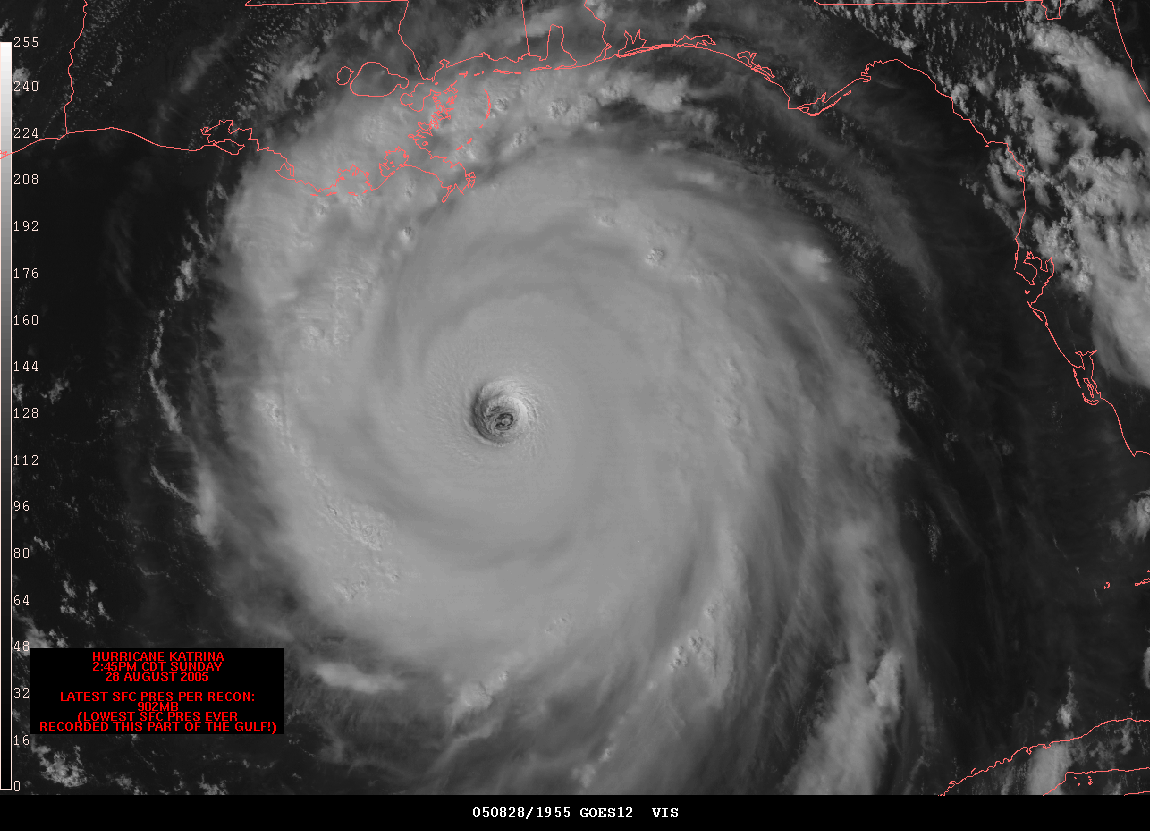
Cartographic animations are generally useful or helpful for showing events when only discrete GI is available. If the cartographic representation has not maintained the integrity of the GI, then substantial errors and distortions can occur. This is a cartographic animation of Hurrican Katrina as it nears New Orleans.
Infrared aerial photo

Infrared aerial photography is a powerful tool. Not only can it be used to document changes to the environment, the health of forests, wetlands, bays and oceans, but it can also be used to document and monitor such items as damage to roofs, pinpointing the source of, and monitoring, insect or disease infested vineyards, or sites contaminated by toxic chemicals, and many other applications. This photo is of “Sacramento Deep Water Channel, CA.”
Bilateral Graph

A bilateral graph is a type of visualization map. Two related variables are identified as well as their overlays. It depicts increases on one side of a zero line and a decrease on the other side. Bilateral graphs are usually used to display data when there are both positive and negative values. This particular map shows the growth in humanitarian assistance in 2005-2006.
Statistical maps

Statistical maps are usually used to display the distribution of a variable over a geographic area, usually defined by political boundaries. This picture shows a statistical map of the United States in 1991 which displays average revenue per kilowatthour for utilities residentially and by state.
Cartograms


Cartograms are a useful and intuitive way to visualize statistical data about a set of regions like countries, states, or provinces. The size of a region in a cartogram corresponds to a particular geographic variable. The most common variable is population: in a population cartogram, the sizes (measured in area) of the regions are proportional to their population. Since the sizes of the regions are not their true sizes they generally cannot keep both their shape and their adjacencies. This cartogram, which is the second picture is a representation of the electoral college’s outcome after the 2004 presidential election. As you can see the top map looks one-sided, but when you use a cartogram it shows that it really wasn’t that one sided at all.
Flow Maps
 Flow maps are used to show the movement of objects from one location to another, such as the number of people in a migration, the amount of goods being traded, or the number of packets in a network. The advantage of flow maps is that they reduce visual clutter by merging edges. This picture shows a noise chart which shows where the noise from airports leaving the airport in Seattle goes and thus who and where the most affected areas are.
Isoline Maps

An isoline map is a map with continuous lines joining points of the same value. Examples would be equal altitude (contour lines), temperature (isotherms), barometric pressure (isobars), wind speed (isotachs), wind direction (isogon), wind shear (isoshear), etc. As with some of the other thematic maps in this blog an Isoline is used for interpreting information. This particular map shows the altitude for China using the isolines to distinguish the difference in this variable.
Proportional circle maps
 A proportional circle map is a statistical map that shows its information by using circles that are proportional to the information that is being provided. In other words the more the total number for the particular category, the bigger the circle will be. In this particular case we see a proportional circle map for the population of Canada.
Isotach

Isotachs are on a specific type of contour map that shows wind speed.through contour lines. As such, the contours upon the isotach map go through points of equal wind speeds. In this map of the Southeastern US, we see the two epicenters, both of which are around the southeastern part of each state. In both areas, windspeed is 40 mph or more.
Isohyet

These differing colors are representative of a type of contour map that deals with the amount of rainfall. More specifically, the isohyet itself is the line drawn through points of equal precipitation over a measured period of time.
Thursday, August 7, 2008
Accumulative line graph or Lorenz curve
 A Lorenz curve shows the distribution of a variable such as population against an independent variable such as income or area settled. If the distribution of the dependent variable is equal, the plot will show as a straight, 45° line. Unequal distributions will yield a curve. The gap between this curve and the 45° line is the inequality gap. Such a gap exists everywhere, although the degree of inequality varies. This particular picture shows how a Lorenz curve shows inequality.
Index Value Plot
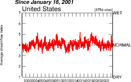
An index value plot is a type of visualization map. An index value is plotted on a line graph. This particular index value plot is of the steam flow averages. The Average Streamflow Index, which is plotted as the red line on the above graph, is calculated each day as the average of the streamflow index values for all the stream gaging stations in the state or water resource region having at least 30 years of record.
Scatter Plots

Scatter plots are similar to line graphs in that they use horizontal and vertical axes to plot data points. However, they have a very specific purpose. Scatter plots show how much one variable is affected by another, in other words it shows their correlation. This particular scatter plot is of spousal abuse and how it is correlated with the age of the people involved.
Choropleth Maps

Choropleth maps portray quantitative data as a color showing the density, percent, average value, or quantity of a phenomenon within the boundary of a geographic area. Sequential colors indicate increasing positive/negative data values. For maps showing positive values, light colors represent lower values and dark colors represent higher values. This particular map shows domestic freshwater use.
Dot Distribution Map

A dot distribution map portrays quantitative data as a dot which represents a number of the phenomenon found within the boundary of a geographic area. The pattern of distributed dots reflects the general locations where the phenomenon was most likely to occur. The pattern and number of dots within a geographic area reveal the density of the phenomenon. This map is used to show the population of the world, a problem with this is that it also gives the perception that some places are uninhabited.

A population profile is a chart showing the number of people as a function of their ages. This particular population profile is of the projected population with and without the AIDS epidemic in Botswana in the year 2020. As you can see there is a significant difference all across the board in the event that the AIDS epidemic would be eradicated.
Climograph

A climograph is a graphical depiction of the monthly precipitation and temperature conditions for a selected place. Precipitation is shown by the bar graph. A line graph depicts temperature. The climograph pictured here is of Memphis, Tennessee.
Windrose
 A windrose is a meteorological diagram depicting the distribution of wind direction and speed at a location over a period of time. Presented in a circular format, the wind rose shows the frequency of winds blowing from particular directions. The length of each "spoke" around the circle is related to the frequency that the wind blows from a particular direction per unit time. This particular windrose is of the city of Seattle.
Propaganda Maps

The power of maps cannot be denied. One of the ways in which maps’ power is showed to have a significant effect is when they are being used to either push an agenda or to convince people to do something. This is where propaganda maps come in, they are used to cause a particular reaction from those who are seeing the map. This particular propaganda map is a pro-Nazi propaganda map. It is intended to paint the British as the aggressor as opposed to the Germans.

Parallel coordinate graphs can show multivariate relations. Theses relations can be obtained through the use of these graphs. The geometric properties of the graph show the corresponding specific properties that it is trying to show. This particular parallel coordinate graph is shown amongst three other types of maps those being a scatterplot (upper left), bivariate map (lower left), time series graph (upper right), and the parallel coordinate graph (lower right).
Triangular Plot

A triangular plot is a graph of a system of three variables. It is most often used in geologic studies to show the relative compositions of soils and rocks, but it can be more generally applied to any system of three variables. The proportions of the three variables plotted always sum to some constant. This particular triangular plot is of a general election in the U.K. in 2005. It was done previous to the election to estimate who would win.
Histogram

The histogram is a graphical way to display frequencies of scores. Basically, the data is collected and is then subdivided into bin widths of equal range. The number of scores to fall into each bin width is counted, and the frequencies are then graphed.. As with any statistical graph, with a large enough sample size the graph should reflect a normal distribution; therefore, if the graph does not look like a normal bell curve there may be some significant reason behind it.
Box Plot
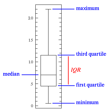
The box plot is a statistical tool for graphically condensing an entire data set into a five number summary. The box plot requires the minimum value of the entire data set; the median; the maximum value; and the first and third quartile values. More specifically, the first and third quartiles are the midway points between the minimum and median and between the median and maximum, respectively. The box plot is a very simple way to see whether a data set is skewed one way or the other, just by comparing the distance between the median and the first quartile with the distance between the median and the third quartile. Another major advantage of the box plot is that it differentiates between the majority of the data and the outliers, thus making the visual representation more reliable than certain other methods of graphing data.
Stem and Leaf Plots

Stem and leaf plots are an efficient way to display data. If you were to imagine that 10 people sitting around a table at a family reunion. Their ages are 32, 1, 45, 37, 8, 9, 55, 81, 34, and 51. You might make a stem and leaf plot using the tens digits from their ages as the "stem" and the ones digits as the "leaves." The plot would look like the picture that is found here.
Similarity Matrix

A similarity matrix is a matrix of scores which express the similarity between two data points. Similarity matrices are used in sequence alignment. Higher scores are given to more-similar characters, and lower or negative scores for dissimilar characters. This similarity matrix compares a recording of TV stream with itself. We can observe that programs can be easily localized because they correspond to blocs of high coefficients around the first diagonal.
Correlation Matrix
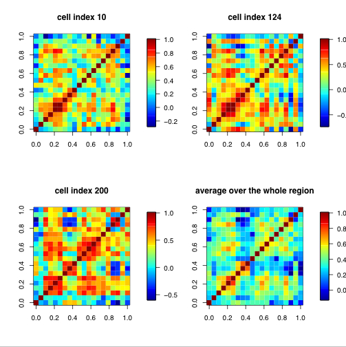
The picture here is an example of a correlation matrix. It is a correlation matrix of 20 climate model biases at certain spatial locations. Each row and column of the matrix represents one of the 20 models in the study, consequently the main diagonal of the matrix is the correlation of the model with itself, and is always unity. Everything off the main diagonal (how one model is correlated to another) is the focus of this study.
Star Plots
Star plots are a useful way to display multivariate observations with an arbitrary number of variables. Each observation is represented as a star-shaped figure with one ray for each variable. For a given observation, the length of each ray is made proportional to the size of that variable. This particular star plot is of automobile data. Each star represents one car model; each ray in the star is proportional to one variable.
Wednesday, August 6, 2008
Hypsometric maps

A map depicting the configuration of the earth’s surface, called the “relief,” by means of contours, form lines, shading, tinting, or relief models. This particular map is a hypsometric map of the Republic of Macedonia, more specifically of Bitola, which is a city in the southwestern part of the republic. This map uses the color to distinguish the extent of the variable.
PLSS maps

The Public Land Survey System (PLSS) is a method used in the United States to survey and identify land parcels, particularly for titles and deeds of rural, wild or undeveloped land. Its basic units of area are the township and section. It was used in the U.S. to help inhabit the West, it was used instead of the metes and bounds system, a British system, that was used in the original 13 colonies. This particular map which I found on ancestry.com is actually a PLSS map of Alabama. As you can see it is very exact and regismented in its dividing of land parcels.
Cadastral maps

Cadastral maps show how land is divided into real property, and sometimes the kinds of built improvements. They show land ownership, rights to land access and use, and obligations. They are best known for their use in taxation and this is particularly important in the U.S. Its significance comes mainly from its role in governance and in land development and speculation. This cadastral map is from the website of the DALIS project and shows a cadastral map of Delaware County, Ohio.
Thematic Maps

Thematic maps are data maps of a specific subject or for a specific purpose. Statistical thematic maps include a variety of different map types such as choropleth or shaded maps, dot maps, and proportional symbol maps. They are a special purpose maps and generally concentrate on a single theme. This map that I found on a universities’ geography class website shows the population change in the U.S. between 1990 and 1996, as you can see it is quite a specific map.
Topographic Map
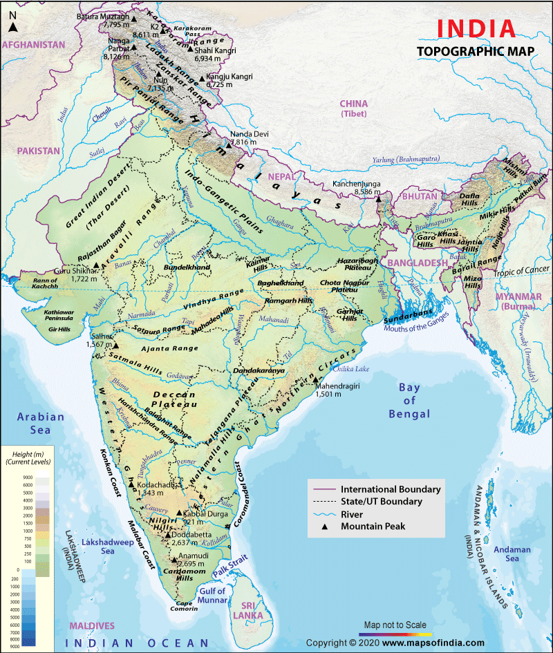
Topographic maps show the physical characteristics of land in an area and the changes in the landscape. Topographic maps are characterized by large-scale detail and quantitative representation of relief, usually using contour lines in modern mapping, but historically using a variety of methods. Traditional definitions require a topographic map to show both natural and man-made features. This particular map is a topographic map of Inda that I got from a website that is called mapsofindia.com.
Planimetric Map

A planimetric map is a map that represents only the horizontal positions of features and not the vertical positions, like heights, the way in which a topographic map would show. This map is from the USGS website and it is a planimetric map of Iraq. It contains information on international boundaries, major cities, roads, railroads, airfields, seas, rivers, lakes, and oil refineries.
Tuesday, July 22, 2008
Standardized choropleth maps

Choropleth maps portray quantitative data as a color showing the density, percent, average value, or quantity of a phenomenon within the boundary of a geographic area. In a standardized choropleth map the data are standardized so that it may allow the comparison of the distribution among different areas. This particular map deals with the population density of Costa Rica. The distributions are able to be compared to each other.
Monday, July 21, 2008
Nominal area choropleth map

Choropleth maps portray quantitative data as a color showing the density, percent, average value, or quantity of a phenomenon within the boundary of a geographic area. In a nominal choropleth map the data that is displayed is nominal data. This particular map is a nominal area choropleth map as it displays nominal data and it is also a unstandardized choropleth map. It shows the minority groups with the highest percentage of state population in certain states of the U.S.
Unstandardized choropleth maps
Choropleth maps portray quantitative data as a color showing the density, percent, average value, or quantity of a phenomenon within the boundary of a geographic area. In an unstandardized choropleth maps only the raw numbers are utilized therefore they are the only ones displayed. Because of this the map data that is displayed is not an average but only the raw data. The variables themselves don’t vary as there is no specific ranking assigned to the any of the variables, in other words, neither of the categories is higher or lower than the other. This particular map portrays all of the states of the United States. Neither of them are attributed a higher value then any of the others but they are all portrayed in a different color, this is a great example of an unstandardized choropleth map.
Univariate choropleth maps

Choropleth maps portray quantitative data as a color showing the density, percent, average value, or quantity of a phenomenon within the boundary of a geographic area. In a univariate choropleth map the map only portrays a single data set. This map is an example of a univariate choropleth map.
Saturday, July 19, 2008
Bivariate choropleth maps/ Cartographic animation

Choropleth maps portray quantitative data as a color showing the density, percent, average value, or quantity of a phenomenon within the boundary of a geographic area. Bivariate choropleth maps display two different variables both of which are displayed on one map by including two different sets of graphic symbols or colors. In this particular map you see the increase from the divorce rate in 1980 to the divorce rate in 1990. This map is also an example of cartographic animation.
Unclassed choropleth maps

Choropleth maps portray quantitative data as a color showing the density, percent, average value, or quantity of a phenomenon within the boundary of a geographic area. The unclassed choropleth map assigns shadings proportional to the data values so that these choropleth maps do not have to classify the data. The map shown is an example of an unclassed choropleth map.
Classed choropleth maps

Choropleth maps portray quantitative data as a color showing the density, percent, average value, or quantity of a phenomenon within the boundary of a geographic area. In a classed choropleth map the main objective is to determine height and shading or color intensity of the bar for each map that is to be classed. This particular map is used to show the quality of life of Brazilians within the country.
Thursday, July 17, 2008
Black and White Aerial Photo
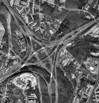
Black and white aerial photos are used to see specific things on the land. They are sometimes used to train pilots because you can see the distinguishable characteristics of the land. This particular photo is of a highway interchange near Baltimore, Maryland.
Subscribe to:
Comments (Atom)